Monday, 21 April 2014

Unit 4 Graphics coursework - Nursery Rhyme Book Cover

Moving on with my Graphics unit 4, I chose 'create my own Nursery Rhyme Book Cover' for my coursework and exam piece.  I picked this topic because I thought there was so much material I could research and develop.

During my research I discovered the creative differences between old and modern book covers, recreated my own versions of popular Nursery Rhyme characters, 'Humpty Dumpty', 'Lil Bo Peep' etc. and experimented with alternative Nursery Rhyme subjects and backgrounds, rather than just draw them.

Here's some images of my work so far...


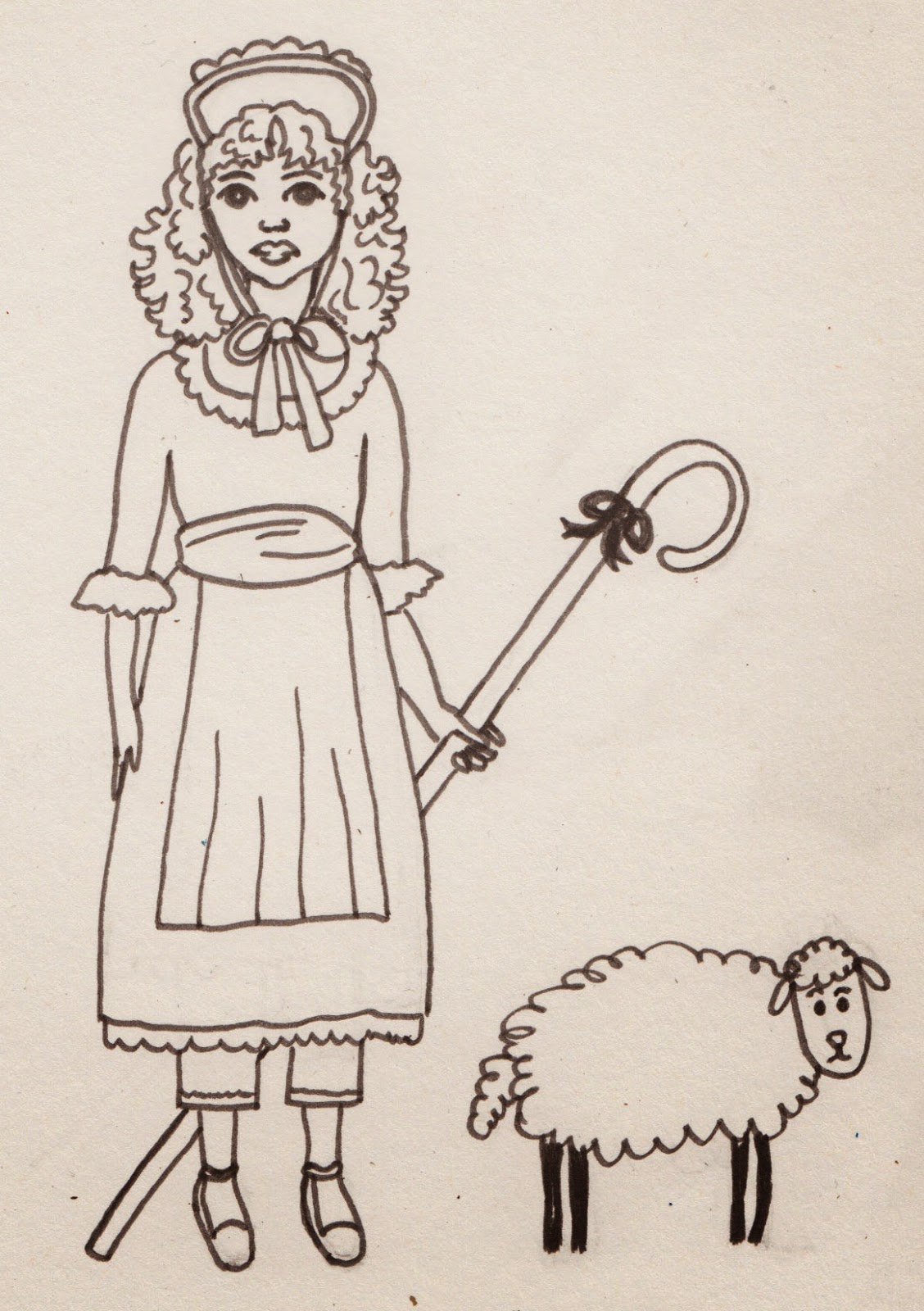
This Kate Greenaway illustration inspired my version of  'Lil Bo Peep'.


My 2nd version of 'Lil Bo Peep' was inspired by 'Belle', created by Mandy Sutcliffe.


My Humpty Dumpty Egg was inspired by Quentin Blake's 'Willy Wonka' character.


Next I wanted to create some backgrounds - here's my version of Humpty's wall.  I added acrylic colours and outlined with black fine liner pen for definition.


 Here's another Nursery Rhyme style acrylic and fine liner background, inspired by book illustrations and children's television shows.


After experimenting with several hand drawn background scenes, I wanted to create my 'stock image', illustrations which could be re-used and added to many Nursery Rhyme book cover experiments.


I love foxes :), so decided to draw my own version - I named him 'James'.  I hand drew James then scanned and coloured in with additional shade and tone, using Photoshop software.


My insects and bugs are inspired by other versions found during my research.  Here again I've hand drawn, scanned and then improved using Photoshop.

 I love my moon and stars illustration, I may use this a my Nursery Rhyme book publisher's logo...


Decided to create a 'stock image' background scene for later use, together with my Lil Bo Peep and other stock images...


Playing with more stock images.  I added colour using acrylic paint, black fine liner and white sharpie pen.


Here I decided to scan different textures into the computer, i.e. scrunched tissue and blue acrylic pattern and fluffy woollen pillow, to make my sky and sheep.  The using my own photographs I cropped, enlarged and enhanced leaves and bark for my trees and bushes and grass for my hills.  I wanted to make my Kate Greenaway inspired Lil Bo Peep look more professional, so I scanned my original illustration and added colour, shade and tone using Photoshop software.  I'm quite pleased with the end result - I think it's unusual, colourful and a little different to what you usually find on and in a Nursery Rhyme book.


Inspired by the vegetable puppets used in CBeebies television programme - Mr Bloom's Nursery.


 I wanted to experiment and develop my own nursery rhyme characters using other foodstuffs - fruit and obviously an egg for Humpty Dumpty.

Here's my foodstuff's photo shoot...


Here's some photo's of my friend and model - Gemma, posing as if she's holding and looking at one of my nursery rhyme characters.


Then I drew and Photoshop enhanced some 'stock image' facial feature's and items of clothing.


Here's a couple of examples of what happened when I put my egg and banana photographs together with eyes, legs, arms and a hat using Photoshop....


Sooooooooooo cute.........:)


Here's a rough Photoshop idea of Gemma interacting with my egg character and butterfly.  This gives me an idea for my Graphics unit 4 exam...


A few 'close up's' of Gemma


Again using Photoshop put them together with my fruit photo's...

My own version of the 'Annoying Orange'

Some scary looking Blueberries :)

And finally, inspired by my fruit faces, I realised that nursery rhymes usually include lots of flowers, so I wanted to see what would happen when I photo-shopped Gemma's face onto one of my flower images...
Can't make my mind up about this - might not be suitable for a Nursery Rhyme book cover - too scary for kids :):):)...

Sunday, 20 April 2014

Modelling for Juniper Journal


Today was very interesting - I modelled for my sister Sam during her 'Juniper Journal' fashion magazine photo shoot.

Juniper Journal is Sam's final major project for her degree course at university.


I was styled, directed and photographed by Sam, while mum followed us around the locations using my iPhone.


When Sam was happy she had enough magazine images, I wanted to help further by piecing together and editing mum's many films using Microsoft Movie Maker.

Here's the final 'behind the scenes' for Juniper Journal's Summer 2014 first edition fashion accessories photo shoot. Juniper Journal - 'Sarah Jane' photo shoot.


Sam really inspires me to work hard, be confident and creative.  Living and working in London while studying for her Fashion Journalism Degree at the London College of Fashion, is not easy - she misses her family (me mostly :) ) and home - she's a true 'Manc' :) :).

Friday, 18 April 2014

Unit 4 Multiple Image Artwork inspired by my local church, St.Anne's C of E, Denton, Manchester

I'm cracking on with my unit 4 work - I chose 'Multiple Images' for my Fine Art coursework and exam.  Part of which I have to find and provide many pieces of Primary (my own photographs and sketches) and Secondary (images etc. created by another person, found on the internet or in books for example) research.

To help with Primary research and inspired by Renaissance multiple images, I contacted my local church, St. Anne's - Denton.


Father Alec kindly allowed me and my mum to take photographs of the beautiful mosaic Salviati triptych's and stained glass windows found inside the church.


Some of St. Anne's many beautiful stained glass windows.

The many delicate and colourful stained glass windows inspired me to create my own multiple image window.  Using a photograph of my model Gemma, carbon paper and pencil, a steady hand, acrylic paints and black ink, I carefully repeated the same image and my own additional decorations, to create my circular window.


St.Anne's famous Salviati mosaic's were my inspiration for my yellow daisy mosaic triptych. More information found in this link. Salviati Mosaics


This piece of artwork took a lot of time, effort and patience.  Inspired by the church 'Daisy' patterned mosaic floor tiles I drew my own daisy, added 1 cm grid-lines over my drawing, then cut into 3 pieces - creating my basic Triptych.


Next I drew 1 cm grid-lines on the reverse of my favourite coloured papers.  I chose a multi patterned brown and gold for the daisy centre and several shades of yellow and orange for the flower petals.  I wanted my daisy to 'stand out' so used black 1 cm paper tiles for my background.

Cutting out and painstakingly gluing individual tiles to my daisy gave me great insight as to how patient and skilled the Salviati craftsmen must have been, when working on the beautiful church displays.

Eventually I finished adding my tiles and carefully cleaned away any excess glue.  I decided to use gold and brown permanent marker pen as my tile 'grout'.  I liked the whole effect but wanted to make the tiles look more convincing, so I carefully pasted clear varnish over everything - however this made the brown pen (grout) smudge, which was really frustrating :(.  I decided to continue pasting with the varnish - spent too much time on my artwork to discard it now, and happily discovered that the brown smears added colour definition and ageing to my now ceramic effect, shiny tiles.  Quite happy with the finished result :).

Continuing with my multiple image theme, I was inspired by the many Renaissance golden triptych paintings found when researching online.  Luckily I found my local art gallery 'The Astley Cheetham Art Gallery' in Stalybridge had the below 'Virgin and Child with Saints' triptych as part of their collection.  I contacted the gallery curator and asked if I could visit and take research photographs of this intricate and beautiful piece of artwork.


However, the curator informed me that the gallery was now closed until Summer 2014 (too late for my Fine Art coursework and exam) for refurbishment and cleaning of their artwork collections.  Which was really unfortunate as my photographs would have been great primary research :(.


But, to my surprise the curator then very kindly securely emailed me my own 'hi resolution' photograph and the galleries permission to use and reproduce this image as part of my unit 4 research and development :).  So I consider this 'virtual' viewing as both Primary and Secondary research.
Below is a larger version of the 'Virgin and Child with Saints', painted around 1380-1400 by the Italian (Florentine) School.

Please note this is not the 'hi resolution' image kindly given to me by the curator at the Astley Cheetham Art Gallery, Stalybridge.
I wanted to create my own Renaissance style golden triptych, but add a more modern twist.  I thought of using fashion models as my subjects.

Having many fashion magazines lying around the house - my sister is a 'Fashion Journalism' university student, I carefully cut out, then scrunched up the model images to 'age' the images.  After applying many coats of gold acrylic paint to card I then arranged and glued on my models.  I wasn't happy with the images, they didn't look 'distressed and antique' enough - so I painted over them with a watery brown acrylic which instantly aged my images.

To create the embossed patterns and halo's found surrounding the Renaissance triptych subjects, I simply used the other end of my paint brush and carefully pressed onto the gold acrylic paint and card, leaving an indentation.  Additional indents enhanced with brown pen helped to create a textured effect to my artwork.

However when studying the original triptych paintings I didn't like how my model images still appeared lifelike, so carefully using a brown fine liner pen I drew around the models, adding definition to their faces and clothing, which immediately made them look more like the Renaissance paintings. :)


Finally I applied a thin coat of clear varnish, to preserve the brown pen definition (thankfully this time the pen didn't smudge) plus make my models appear more like they had been painted.  I'm really happy with the finished result, I think my 'Fashion Model' triptych is a modern day version of the Renaissance religious 'icon's'.

Saturday, 12 April 2014

Final A2 Media Film Trailer, Poster and Magazine Front Cover and Public Feedback and Evaluations

At last I've completed everything for my A2 Media Coursework - please take a look at my A2 media blog using this link. Completed A2 Media coursework


Now I have to start putting myself on 'lock-down', stock up on the Lucozade and Nutrigrain Bars (maybe the odd 'Strawberry Shoelace') as there's an exam written paper revision storm coming called 'Critical Perspectives in Media' - NOOooooooooooo :(.

10th June - day before my 18th birthday and I have a written exam, suppose it's marginally better than taking a Maths GCSE on my 16th birthday. Sounds like loads of time for plenty of revision, I wish - I still have Fine Art and Graphics sketchbooks and final pieces to produce and finish, plus come up with ideas/prepare for and take 2 x 15 hour exams - I'm not really complaining........

Keep going - wish me luck for 10th June :).