I'm cracking on with my unit 4 work - I chose 'Multiple Images' for my Fine Art coursework and exam. Part of which I have to find and provide many pieces of Primary (my own photographs and sketches) and Secondary (images etc. created by another person, found on the internet or in books for example) research.
To help with Primary research and inspired by Renaissance multiple images, I contacted my local church, St. Anne's - Denton.

Father Alec kindly allowed me and my mum to take photographs of the beautiful mosaic Salviati triptych's and stained glass windows found inside the church.
Father Alec kindly allowed me and my mum to take photographs of the beautiful mosaic Salviati triptych's and stained glass windows found inside the church.
 |
Some of St. Anne's many beautiful stained glass windows. |

The many delicate and colourful stained glass windows inspired me to create my own multiple image window. Using a photograph of my model Gemma, carbon paper and pencil, a steady hand, acrylic paints and black ink, I carefully repeated the same image and my own additional decorations, to create my circular window.

St.Anne's famous Salviati mosaic's were my inspiration for my yellow daisy mosaic triptych. More information found in this link. Salviati Mosaics

This piece of artwork took a lot of time, effort and patience. Inspired by the church 'Daisy' patterned mosaic floor tiles I drew my own daisy, added 1 cm grid-lines over my drawing, then cut into 3 pieces - creating my basic Triptych.
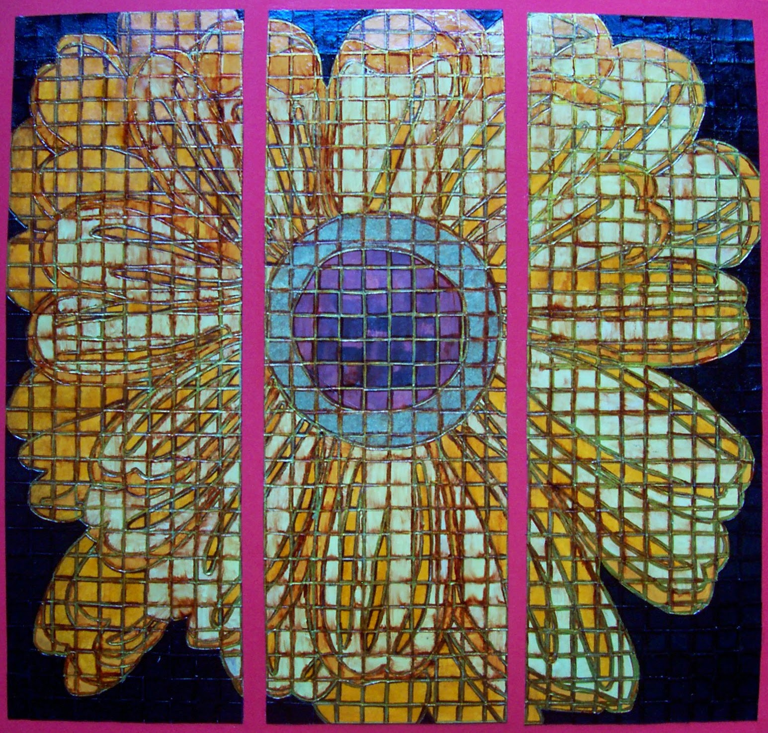
Next I drew 1 cm grid-lines on the reverse of my favourite coloured papers. I chose a multi patterned brown and gold for the daisy centre and several shades of yellow and orange for the flower petals. I wanted my daisy to 'stand out' so used black 1 cm paper tiles for my background.
Cutting out and painstakingly gluing individual tiles to my daisy gave me great insight as to how patient and skilled the Salviati craftsmen must have been, when working on the beautiful church displays.
Eventually I finished adding my tiles and carefully cleaned away any excess glue. I decided to use gold and brown permanent marker pen as my tile 'grout'. I liked the whole effect but wanted to make the tiles look more convincing, so I carefully pasted clear varnish over everything - however this made the brown pen (grout) smudge, which was really frustrating :(. I decided to continue pasting with the varnish - spent too much time on my artwork to discard it now, and happily discovered that the brown smears added colour definition and ageing to my now ceramic effect, shiny tiles. Quite happy with the finished result :).
Continuing with my multiple image theme, I was inspired by the many Renaissance golden triptych paintings found when researching online. Luckily I found my local art gallery 'The Astley Cheetham Art Gallery' in Stalybridge had the below 'Virgin and Child with Saints' triptych as part of their collection. I contacted the gallery curator and asked if I could visit and take research photographs of this intricate and beautiful piece of artwork.

However, the curator informed me that the gallery was now closed until Summer 2014 (too late for my Fine Art coursework and exam) for refurbishment and cleaning of their artwork collections. Which was really unfortunate as my photographs would have been great primary research :(.
But, to my surprise the curator then very kindly securely emailed me my own 'hi resolution' photograph and the galleries permission to use and reproduce this image as part of my unit 4 research and development :). So I consider this 'virtual' viewing as both Primary and Secondary research.
Continuing with my multiple image theme, I was inspired by the many Renaissance golden triptych paintings found when researching online. Luckily I found my local art gallery 'The Astley Cheetham Art Gallery' in Stalybridge had the below 'Virgin and Child with Saints' triptych as part of their collection. I contacted the gallery curator and asked if I could visit and take research photographs of this intricate and beautiful piece of artwork.
However, the curator informed me that the gallery was now closed until Summer 2014 (too late for my Fine Art coursework and exam) for refurbishment and cleaning of their artwork collections. Which was really unfortunate as my photographs would have been great primary research :(.
But, to my surprise the curator then very kindly securely emailed me my own 'hi resolution' photograph and the galleries permission to use and reproduce this image as part of my unit 4 research and development :). So I consider this 'virtual' viewing as both Primary and Secondary research.
Below is a larger version of the 'Virgin and Child with Saints', painted around 1380-1400 by the Italian (Florentine) School.
 |
| Please note this is not the 'hi resolution' image kindly given to me by the curator at the Astley Cheetham Art Gallery, Stalybridge. |
Having many fashion magazines lying around the house - my sister is a 'Fashion Journalism' university student, I carefully cut out, then scrunched up the model images to 'age' the images. After applying many coats of gold acrylic paint to card I then arranged and glued on my models. I wasn't happy with the images, they didn't look 'distressed and antique' enough - so I painted over them with a watery brown acrylic which instantly aged my images.
To create the embossed patterns and halo's found surrounding the Renaissance triptych subjects, I simply used the other end of my paint brush and carefully pressed onto the gold acrylic paint and card, leaving an indentation. Additional indents enhanced with brown pen helped to create a textured effect to my artwork.
However when studying the original triptych paintings I didn't like how my model images still appeared lifelike, so carefully using a brown fine liner pen I drew around the models, adding definition to their faces and clothing, which immediately made them look more like the Renaissance paintings. :)

Finally I applied a thin coat of clear varnish, to preserve the brown pen definition (thankfully this time the pen didn't smudge) plus make my models appear more like they had been painted. I'm really happy with the finished result, I think my 'Fashion Model' triptych is a modern day version of the Renaissance religious 'icon's'.
No comments:
Post a Comment